Singapore’s government (and Mentos was involved in this awkward project) used this ad on their National Day celebrations to encourage people to copulate and increase Singapore’s birth rate. I hypothesized that a low fertility rate (number of children per woman) was not unique to Singapore (though the problem might be more acute in Singapore).
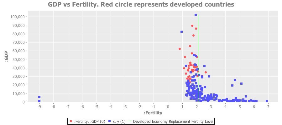
Here’s a plot of GDP vs. fertility rates for all nations. The red dots are the devloped countries:

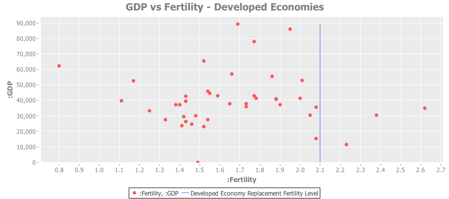
Clearly the poorest nations have a ridiculously high fertility rate. The red dots represent the developed economies - almost all of which lie below the replacement fertility rate of 2.1
Here’s a plot of just the developed economies:

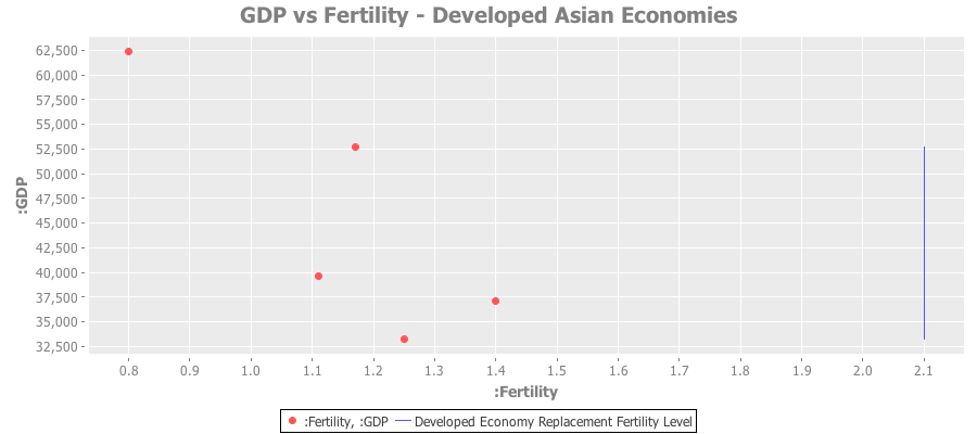
And a similar plot for developed Asian economies:

Full source code and datasets available in this github repo.